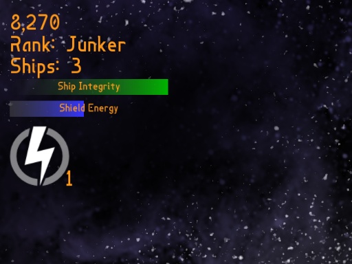
Today I added a health bar to the in-game interface, and I have been meaning to blog about this interface for a while. You might first notice that it is very minimal. Minimal interfaces just feel old school to me. A fancy spaceship-themed interface that takes up a lot of screen space would be too much.
The first three lines are score, rank, and number of ships remaining. The rank feature will probably get thrown out. I have tried to make it work as an extra item to go along with your score and as a value that fluctuates with your performance to affect score or distribution of power-ups and weapons. Unfortunately, every way I look at it it feels redundant and pointless.
The Ship Integrity and Shield Energy bars are pretty much what you would expect. When you get damaged your ship sparks and smokes for a few seconds and then your Ship Integrity recharges to full. I didn’t include the explicit Ship Integrity bar until now because your health is effectively implied by all the sparking. However, in accordance with Wickens’s Principle of Redundancy Gain, this seems like a good way to make your health more apparent.
Occasionally people have asked why your health drains so rapidly when you take damage and then recharges. The reason is that Retrobooster is intended to be a high-tension game where death comes quickly, following the old school model of multiple lives as opposed to giving you one life with a lot of health. Some enemy weapons fire is too weak to kill you instantly, but it still takes very little to kill you compared to most games so tight situations become deadly very fast. This also adds an element of strategy because you can decide what enemy weapons fire to avoid the most and whether or not to use your shields. This lives-based model is also reinforced by the many obstacles in the game that can crush you instantly. In the presence of such obstacles, having only one life that could be lost instantly would make for very short games. And removing those obstacles to make this a health-based game would make it a completely different game.
At the bottom there is a secondary weapon icon and a number showing how many of these weapons you are carrying. The icon changes as you cycle through weapons. Your primary weapon is always the same. You gain ammo for secondary weapons by picking up tokens that appear when you destroy enemies or rescue survivors.
A current problem is that the primary weapon is so powerful that testers rarely use the secondary weapons. Simply making the primary weapon weaker feels frustrating to me. I might try to fix the problem by adding more primary weapons where only the weakest would have unlimited ammo. The primary weapons would probably all be forward shooting weapons while the secondary weapons would be mostly area weapons or single-shot weapons like the guided missile.
I still need to add something to the interface to show what power-ups you have and how much time is remaining for each one. I have not decided the best way to do this yet. And if I add more primary weapons, I may need to change the way the power-ups work since most of them currently affect the single existing primary weapon.

